Introduction
Recently, we were tasked with providing context to prison placement in the state of Pennsylvania. Up until the mid-1990’s, Pennsylvania deliberately placed its state inmates as far from the county in which they were arrested as possible, according to Susan McNaughton, Communications Director for Pennsylvania Department of Corrections. The justification was that prison relocation could be used as an incentive for good behavior. Upon realizing the extraordinary strain this strategy placed on the loved ones of inmates, the state began including home—or committing county—as one factor when determining inmate placement.
Due to the size of Pennsylvania and other variables that limit nearby prison placement: rural prison locations, the clustering of prisons, bed availability, and population-specific prisons (female, geriatric, young adult, capital punishment), average travel time between committing county and assigned prison remains high.
Flow Maps
To contextualize travel times and shed light on commutes between loved ones and their inmates, we started by highlighting the travel of a single individual, Krystal Bush. Ms. Bush, a loved one of an inmate, started a bus service in response to the need of bringing families to their loved ones in prisons throughout rural Pennsylvania.
The route Kristal Bush takes from Philadelphia to Smithfield State Prison takes an average of 3 hours and 16 minutes. Currently, 28% of inmates are placed this distance or further from their homes, with some inmates placed as far away as 6 hours and 20 minutes. The images below illustrate the process of mapping the flow of inmates to each prison.
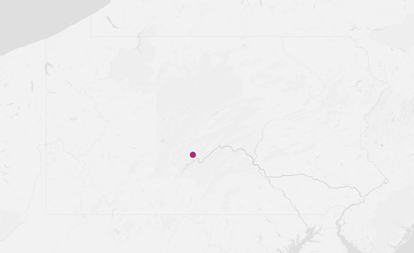
Single Driving Route
The map below shows the driving route from Philadelphia County to Huntingdon Prison.
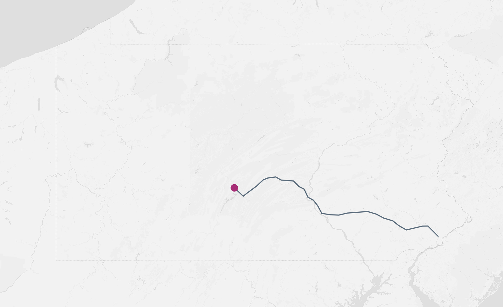
Weighted Driving Route
The second map shown below represents the same route, weighted by the 709 prisoners committed to Huntingdon Prison from Philadelphia County.
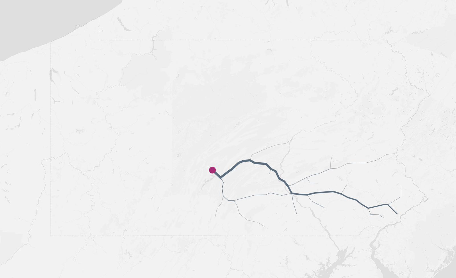
Weighted Road System (Southeast)
Next, the line is further weighted as the traffic of 1303 men from 17 committing counties aggregates along the road system that runs between Philadelphia to Huntingdon, like streams joining a river.
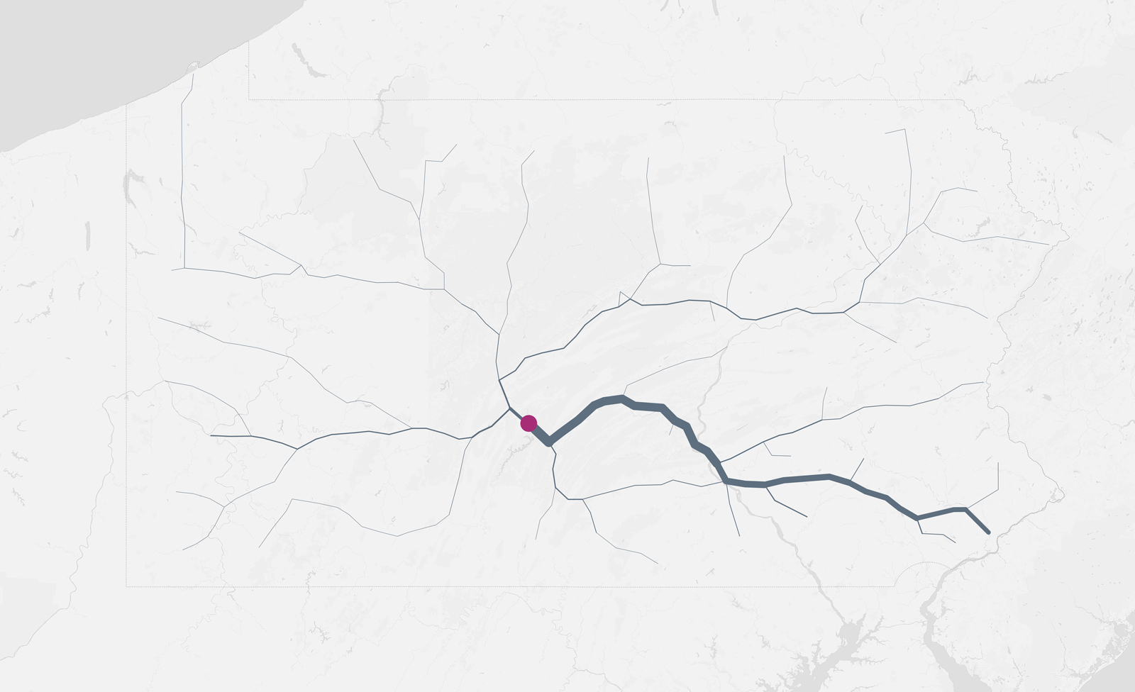
Weighted Road System (Pennsylvania)
Finally, the map below shows Huntingdon State Prison’s total population of 2067 men coming from 64 of Pennsylvania’s 67 counties. When routes converge via major arteries of Pennsylvania’s road system, the weight of the line scales accordingly.
Pennsylvania Contextualized
In the graphic below, each map reveals the geographical distribution of inmates in each of Pennslyvania’s 25 other state prisons. This distribution is represented by driving routes between the prison and the committing counties of its inmates. The weight of the route line corresponds to the number of inmates who share that path to prison, a route often repeated by their loved ones.
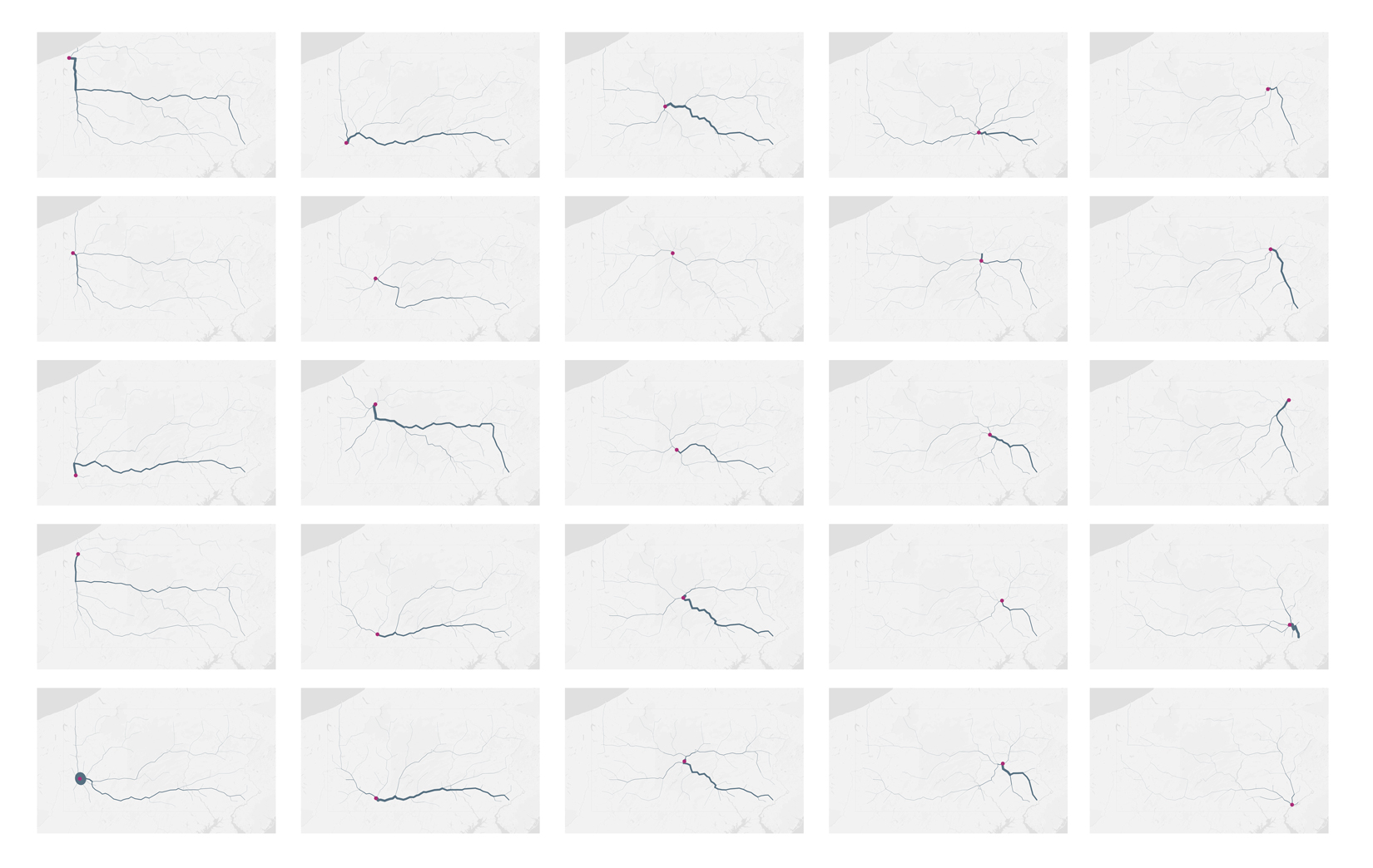
Pennsylvania State Prisons shown in order of longitude, west to east, arranged top to bottom, left to right: Albion, Mercer, Greene, Cambridge Springs, Pittsburgh, Fayette, Pine Grove, Forest, Laurel Highlands, Somerset, Houtzdale, Quehanna Boot Camp, Smithfield, Rockview, Benner Township, Camp Hill, Muncy, Coal Township, Frackville, Mahanoy, Retreat, Dallas, Waymart, Graterford, Chester
Isochrone Maps
The next task we set to accomplish was to visualize inmates committed from Philadelphia, specifically. Philadelphia County sends more people to state prison than any other county in Pennsylvania. Its 26 state prisons incarcerate approximately 48,000 people. Nearly 13,700, or 28.5 percent, were sentenced in Philadelphia. Because just two state prisons lie within 1 hour and 45 minutes of the city, most prisoners prosecuted in Philadelphia end up many hours away.
The 3 hour and 16 minute van ride that Kristal Bush makes from Philadelphia to Huntingdon and Smithfield State Prisons—seen in the dark green band—is a distance many Philadelphia families must travel to see their loved ones. More than 50 percent of prisoners committed in Philadelphia County are incarcerated a drive of three hours or more from the city. Only one other county in the state has prisoners placed farther away.
That distance means families often bear the burden, and the cost, of long commutes to maintain ties with loved ones behind bars.
The isochrone map below illustrates through color bands the commute from Philadelphia County to each of Pennsylvania’s 26 state prisons.
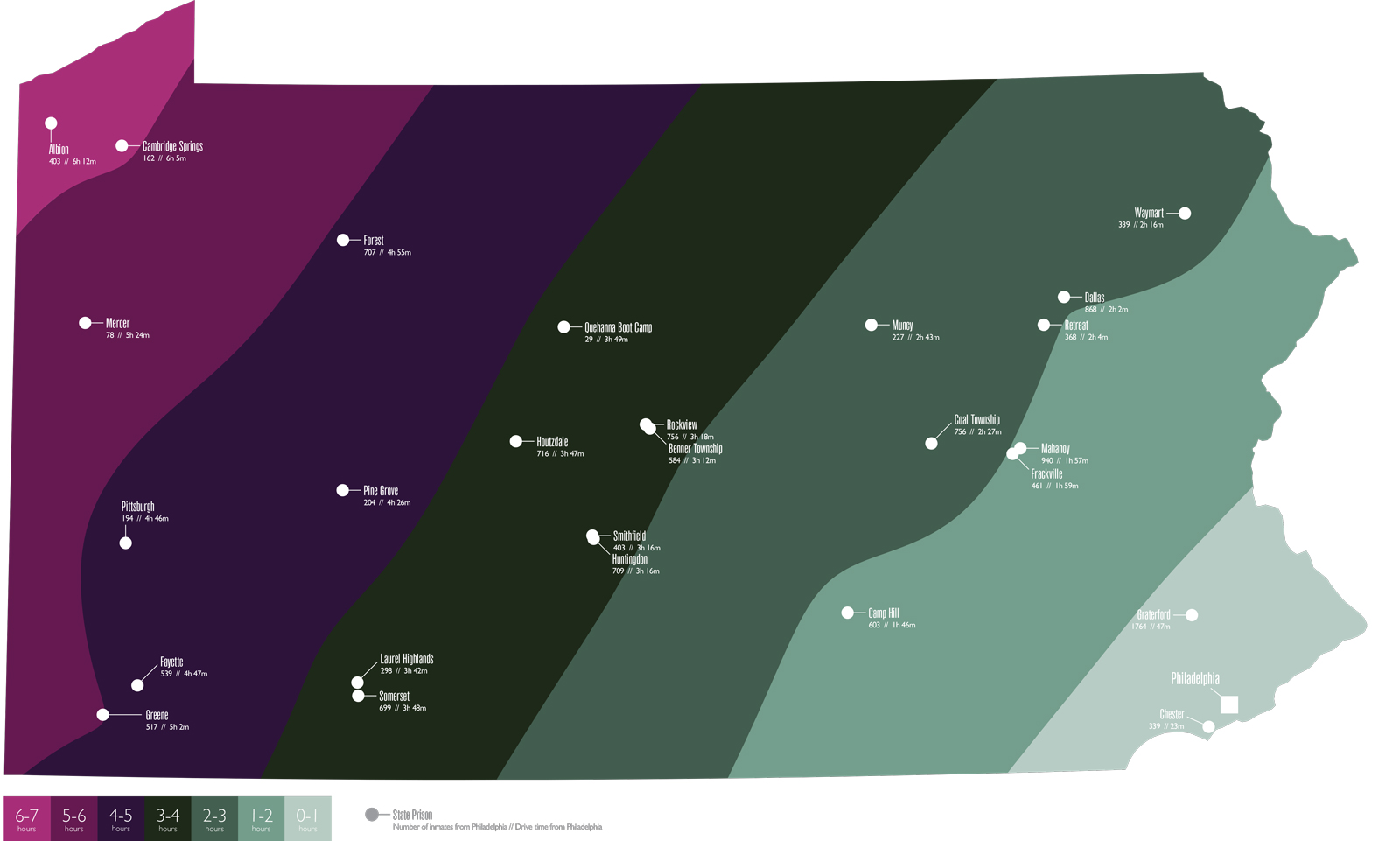
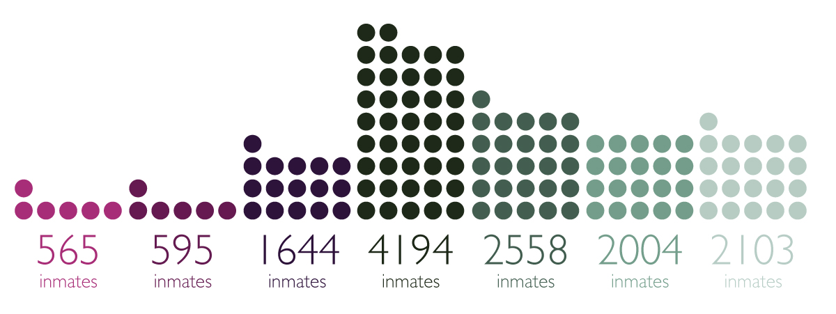
And by adding up the inmates placed in the different hour bands of Philadelphia, we start to see the unfortunate placement of prisons relative to the population center.
This work was supported by the Brown Institute. Statistical analysis by Mark Hansen, design support by Dalit Shalom, project partnership with Zara Katz and Lisa Riordan Seville.